The Context
ALBERT BAPTISTE is a french clothing brand created in South of France.
The creations are fully handcrafted, from their conception to the finishes. The clothes have a vintage style from the Belle Epoque, with a contemporary diversion, and are destined to a 20 to 35 years old audience.
The Project
The company being created at the time of the brief, everything was to do ! And the freedom I could have had on this project makes it one of my favourite.
From the logo to the visual identity, the photo shooting, the print and web communication medias : I was in charge of the whole communication of this young fashion creative.
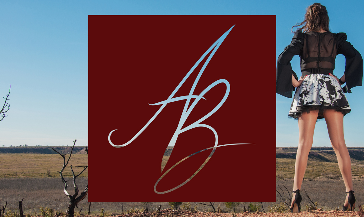
The Logo
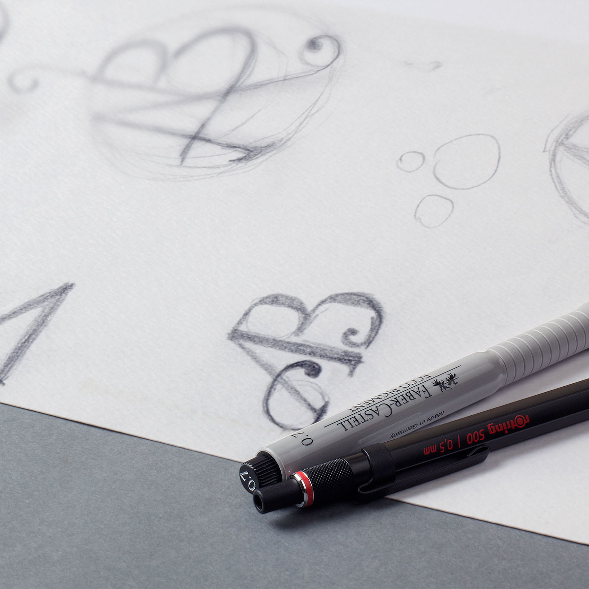
The Research
The client wished a calligraphic logotype, with the initials of the brand. I wished to propose her a signature logo type, since the brand is the property of an independant fashion designer.

The Color
I perceived a burgundy red aura on the client, I wanted to mix the sweet side of the color with the charm of her collection pour make it its main color of her visual identity.
The Logo
The achieved logotype.
It is easily integrated to the website but also on the clothing labels.
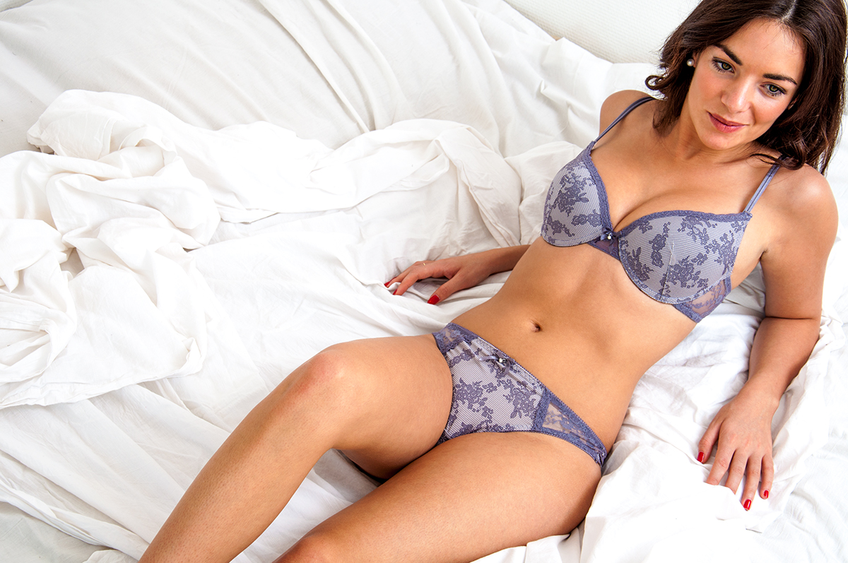
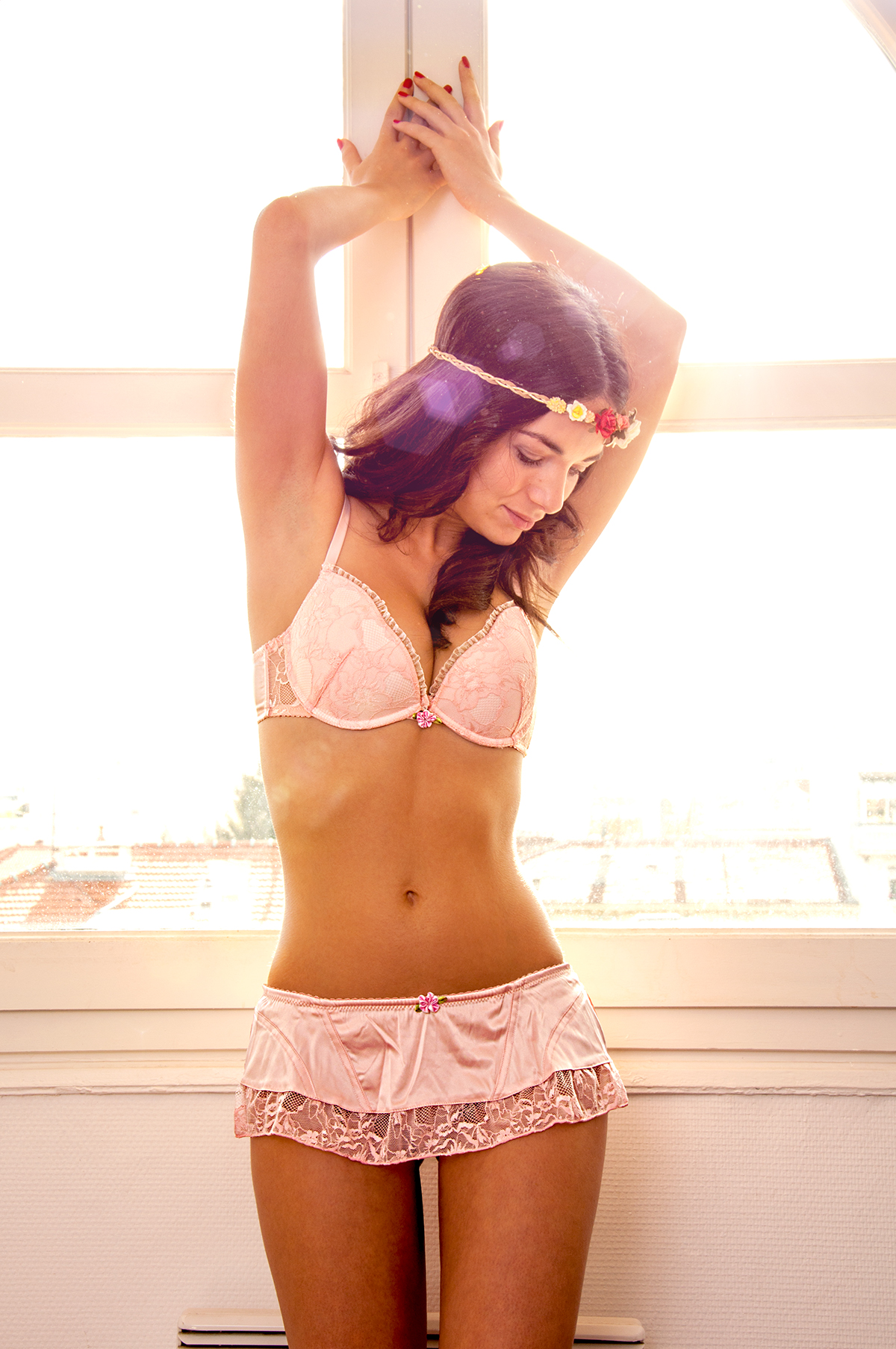
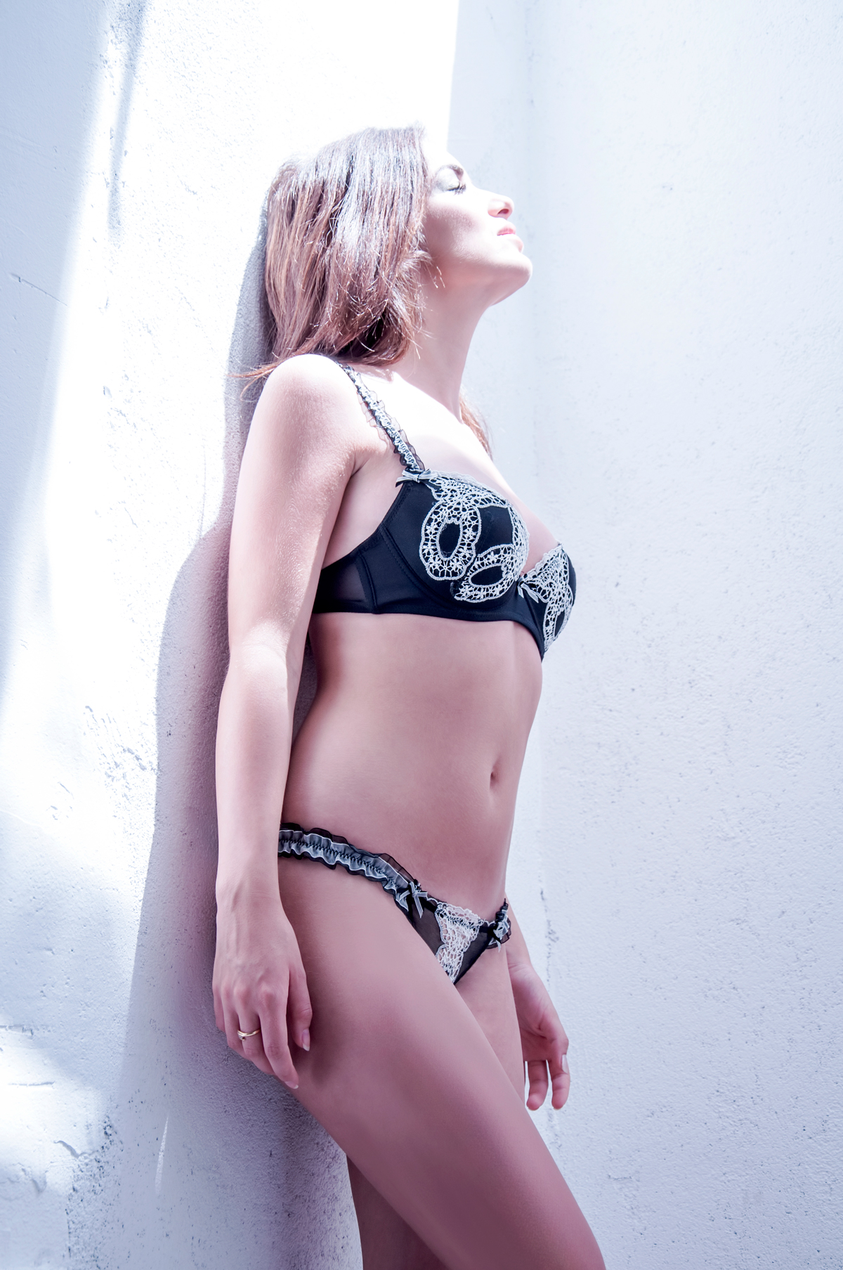
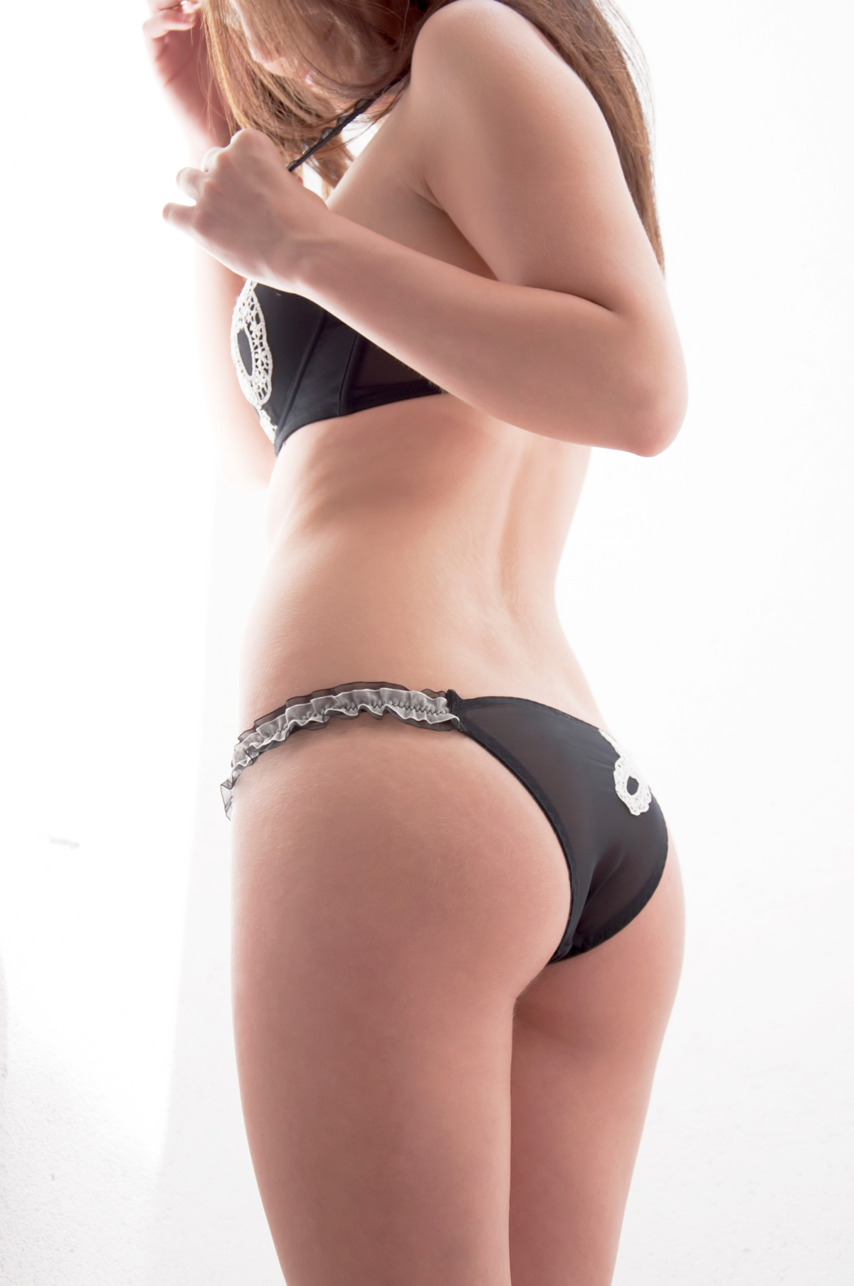
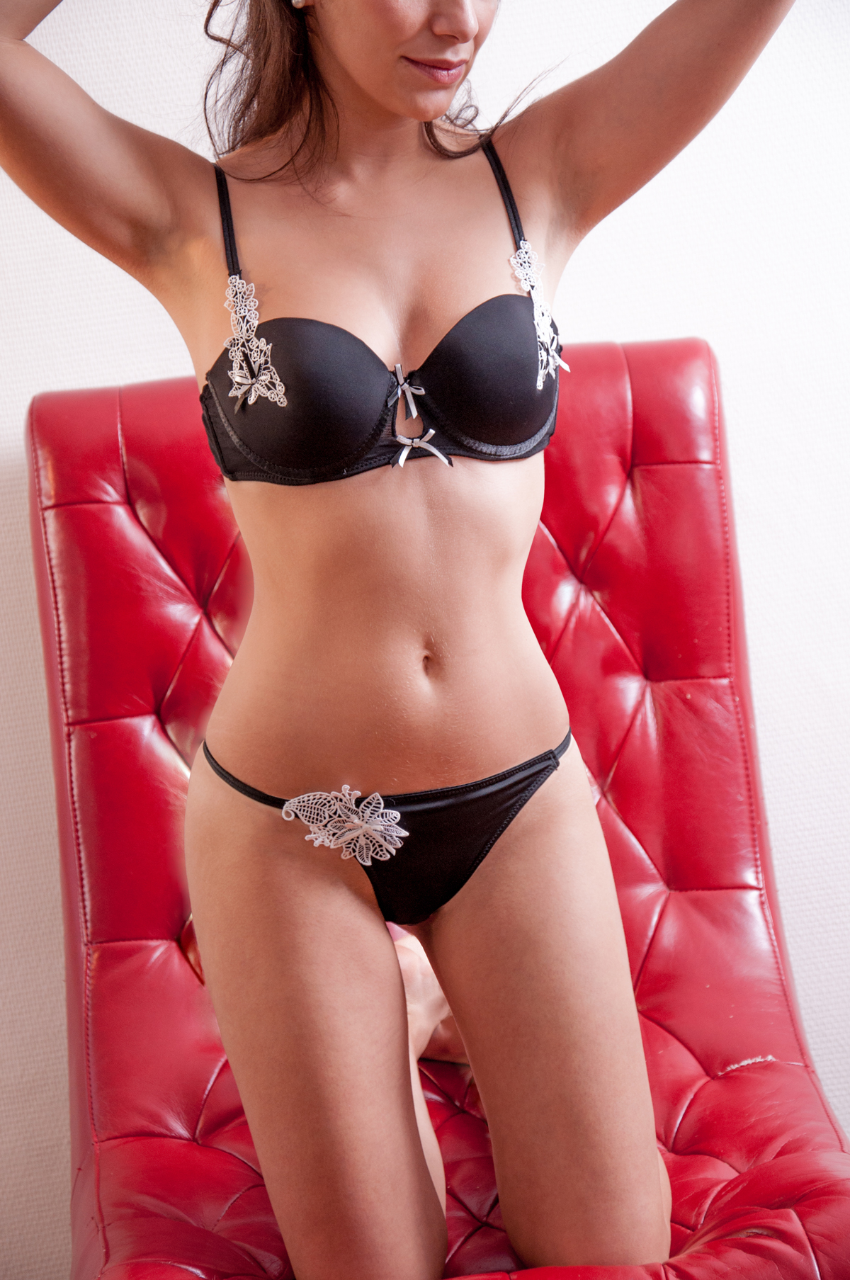
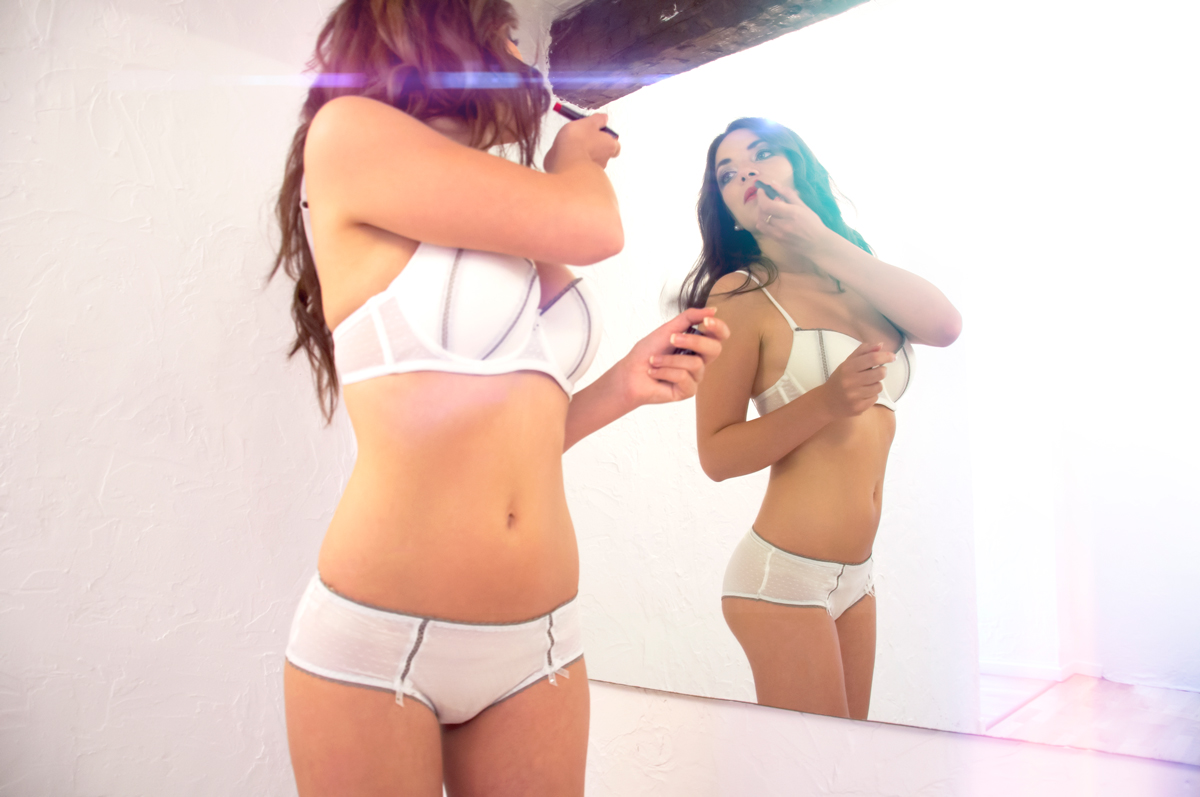
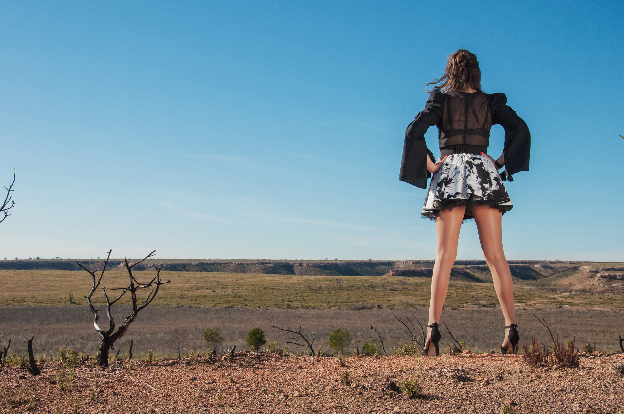
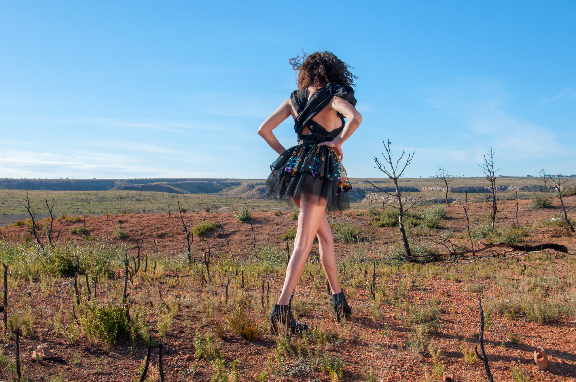
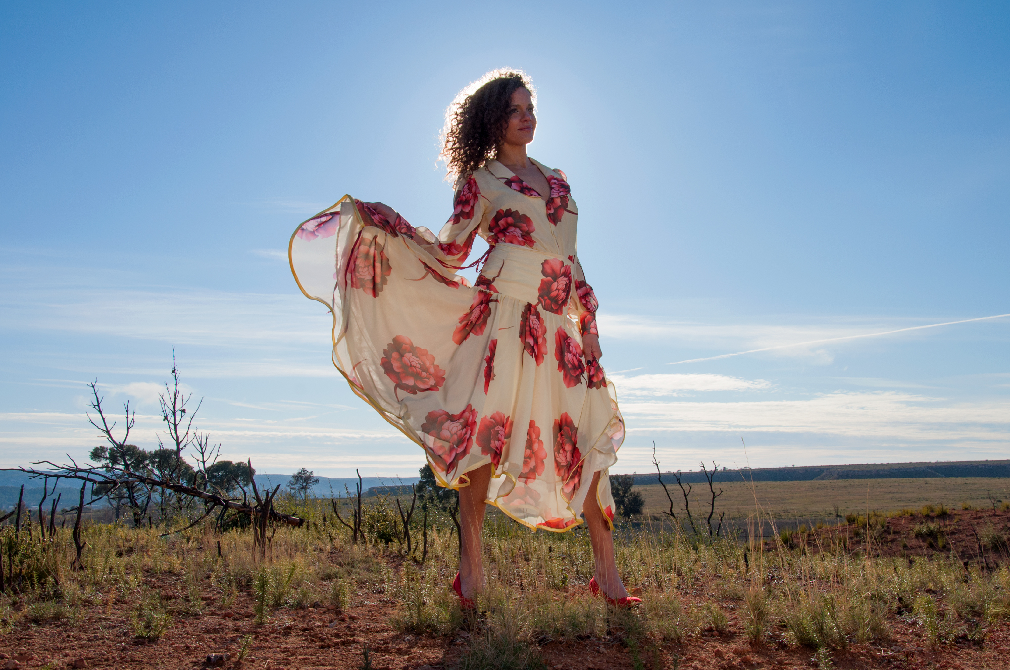
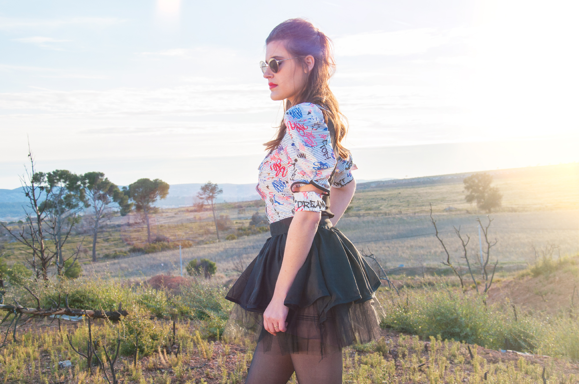
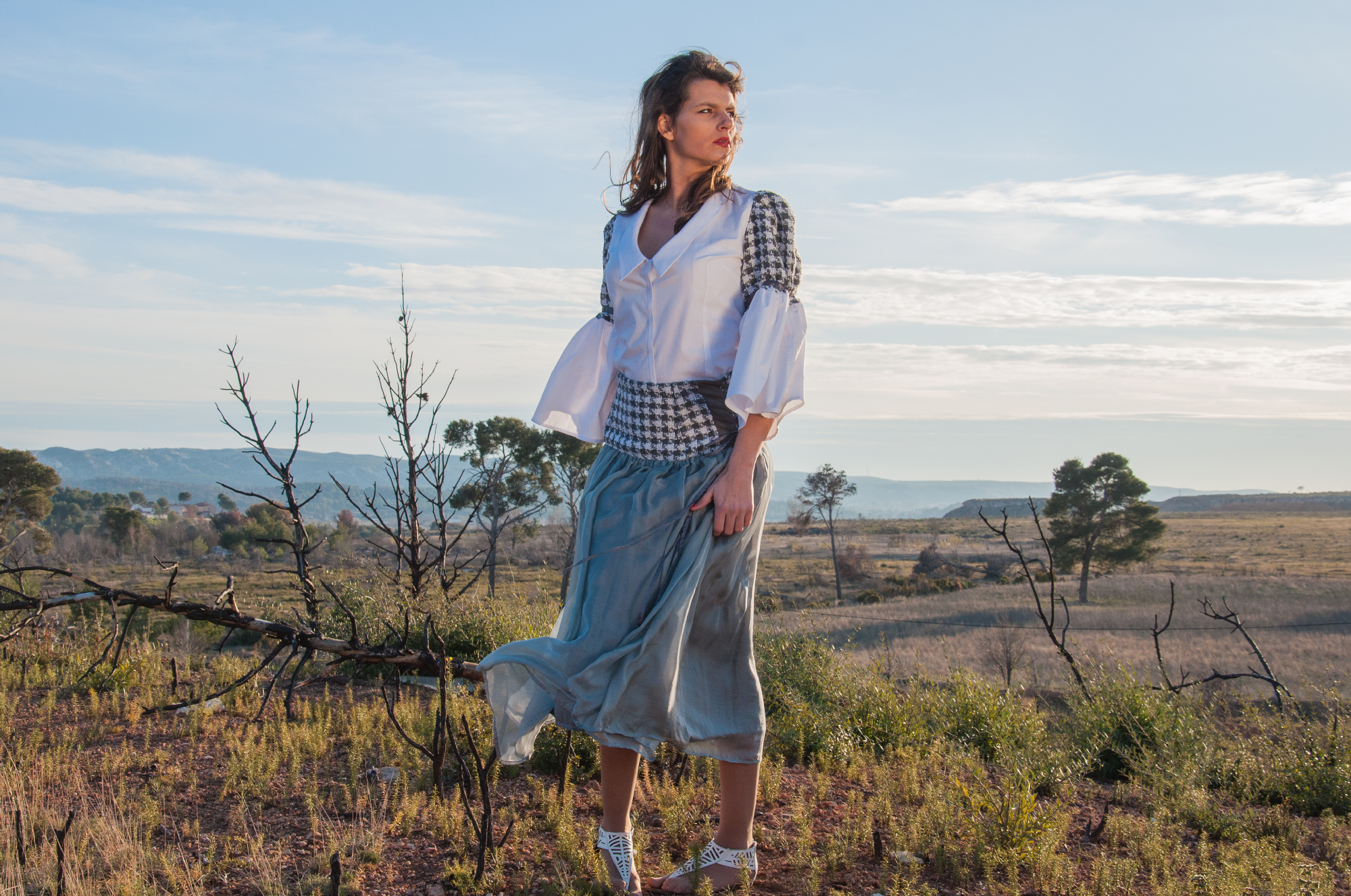
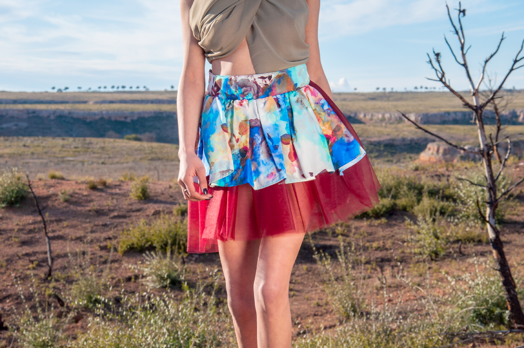
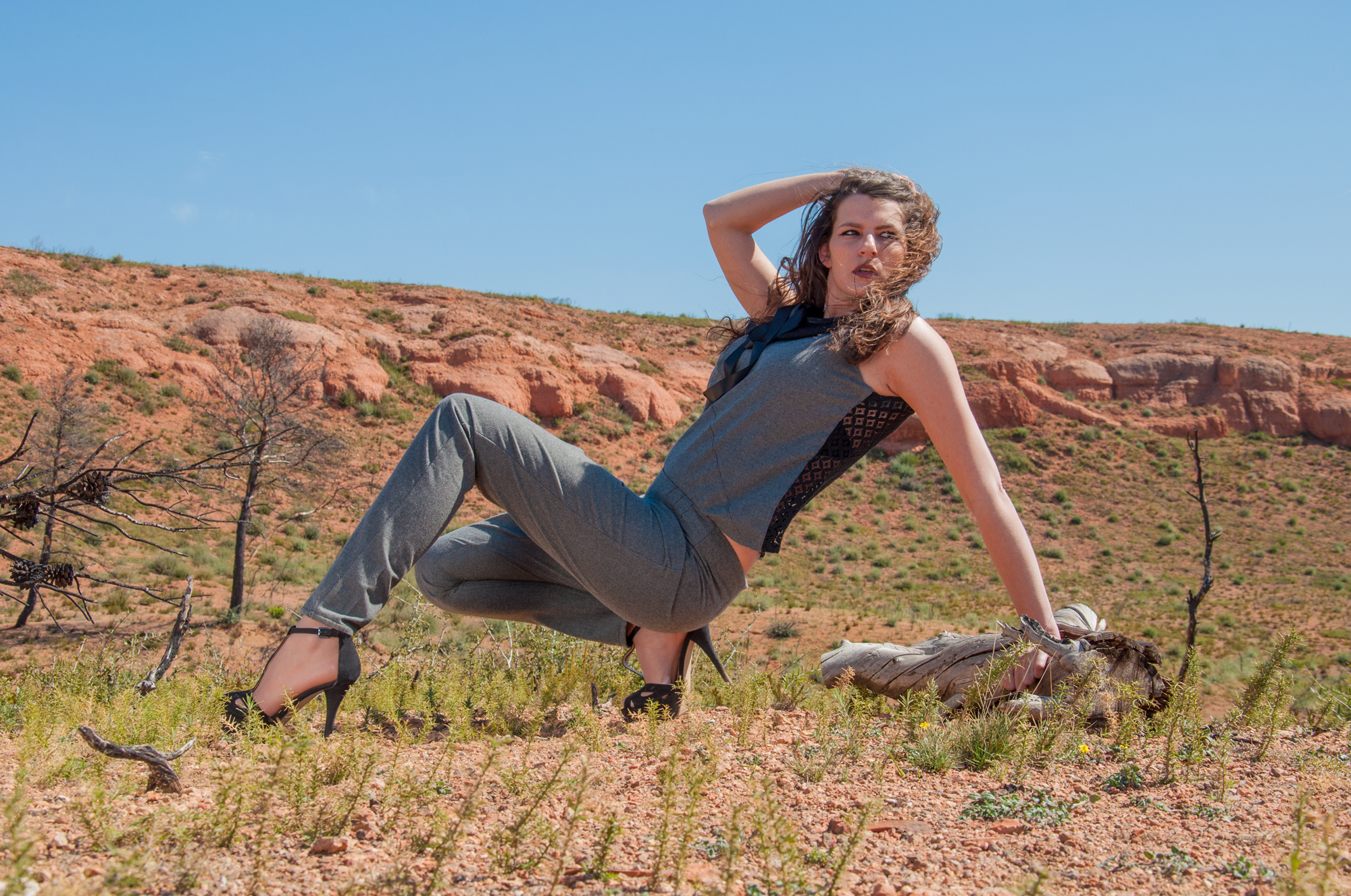
Le Photo Shooting
The photo shoot had to show both a touch of originality while highlighting the products. The photos had to portray a universe both dreamlike and clearly present the product.
Most of the photos have been taken horizontally for future use on the web.


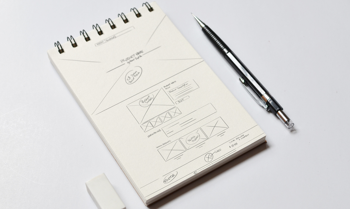
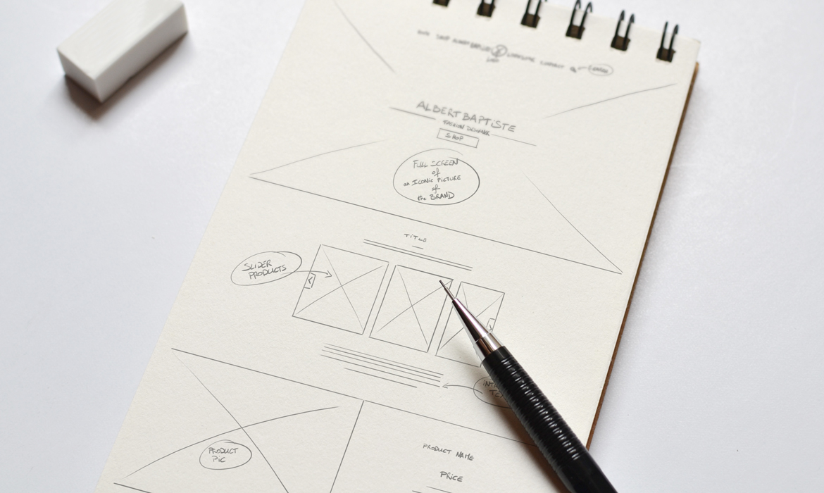
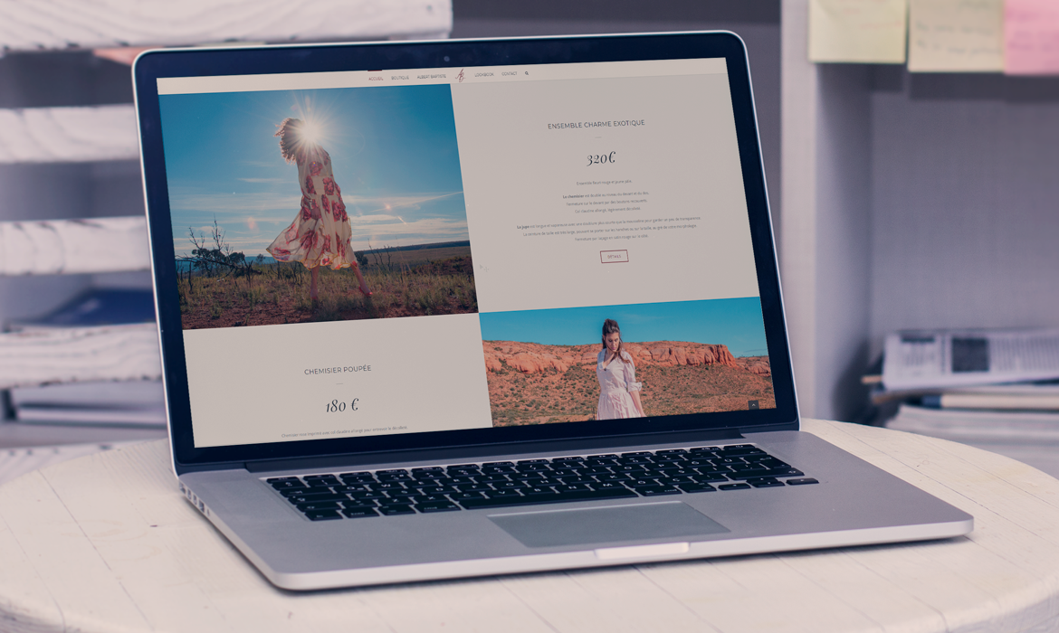
The Web Site & the Shop
The website was designed to highlight the quality of photos and present the product clearly and from all angles.
Most pages feature full-page articles to emphasize the graphic side of the brand.
Each article also has its own product profile on ETSY, a platform for the sale of personal creations and made by hand.