Portfolio

My Digital Portrait

2018-10-17T00:17:27+01:00

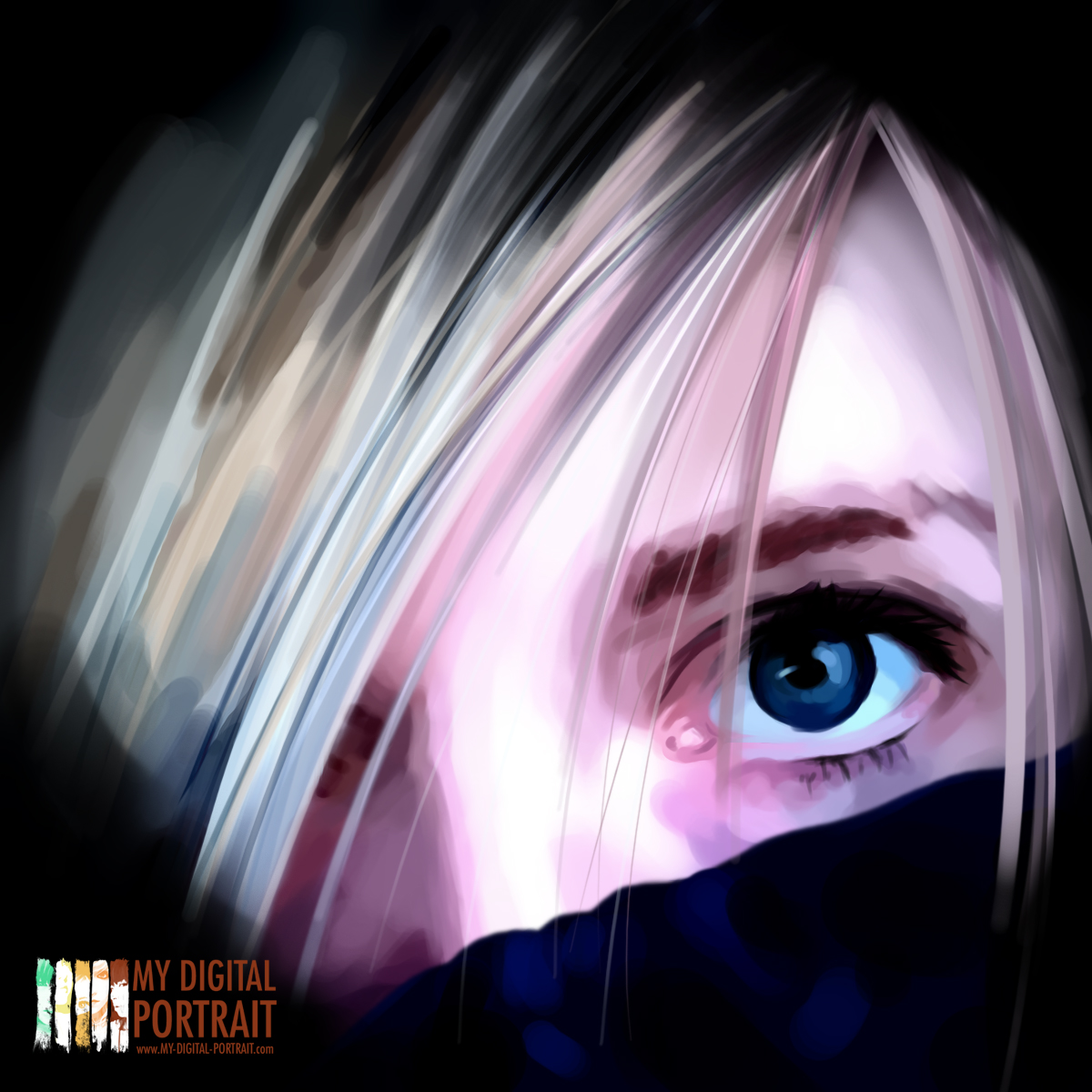
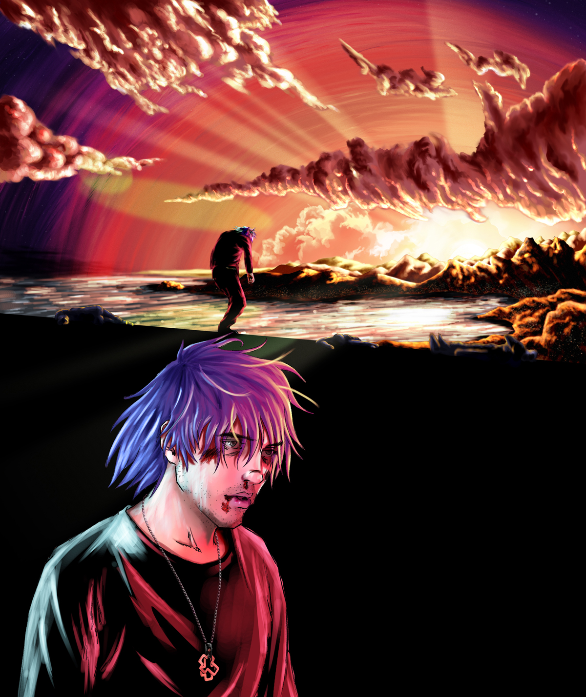
My Digital Portrait is born during the early months of Instagram, way before its buyout by Facebook and the current popularity of the social network.

À l’époque, pendant que j’explorais les selfies des uns et des autres, j’ai souhaité redessiner certain visages, puis je les publiais et les postais en taguant les personnes concernées. Rapidement, je recevais environ 5 à 8 requêtes par jour pour redessiner des instagramers.

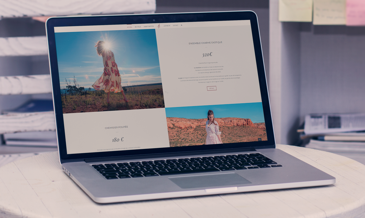
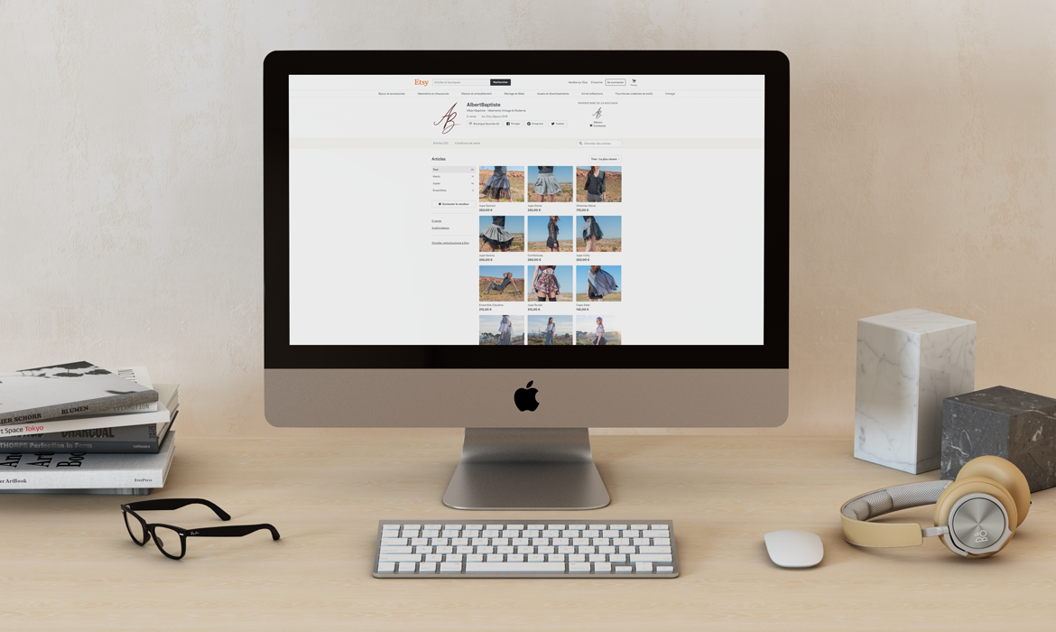
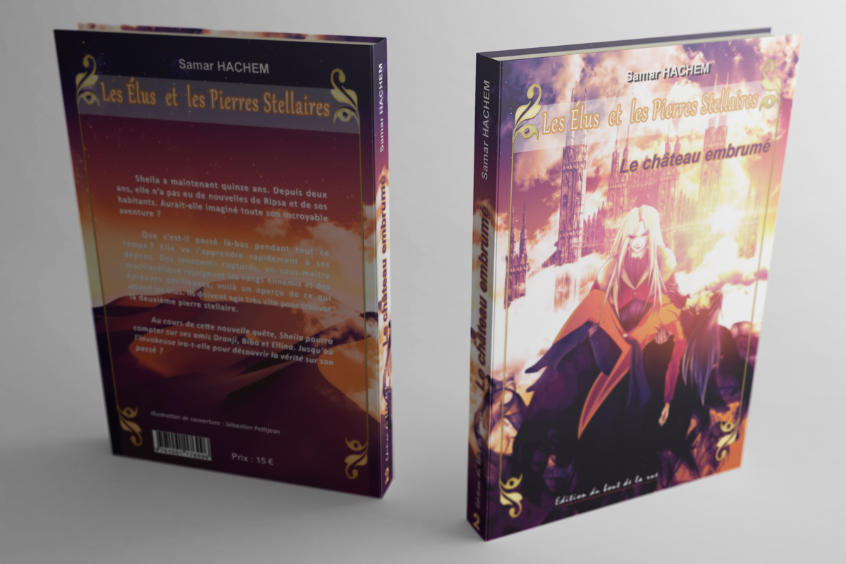
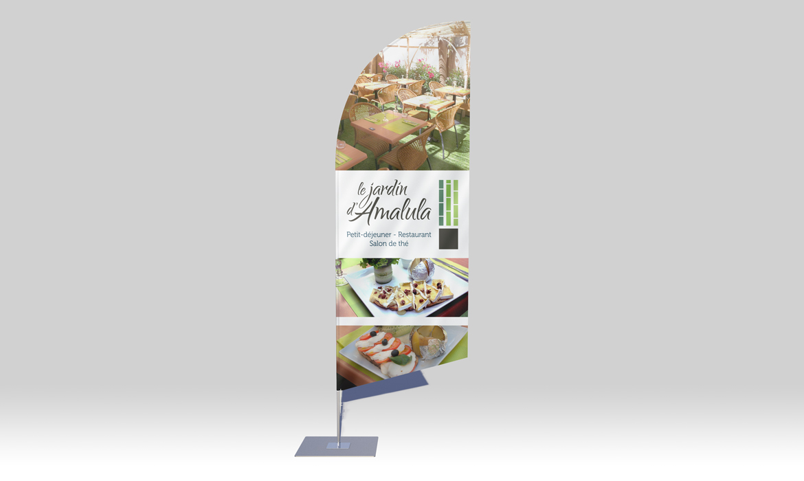
Au fil du temps, mon style s’est affiné et diversifié, et j’ai décidé de créer une boutique en ligne de t-shirts avec mes illustrations les plus populaires.

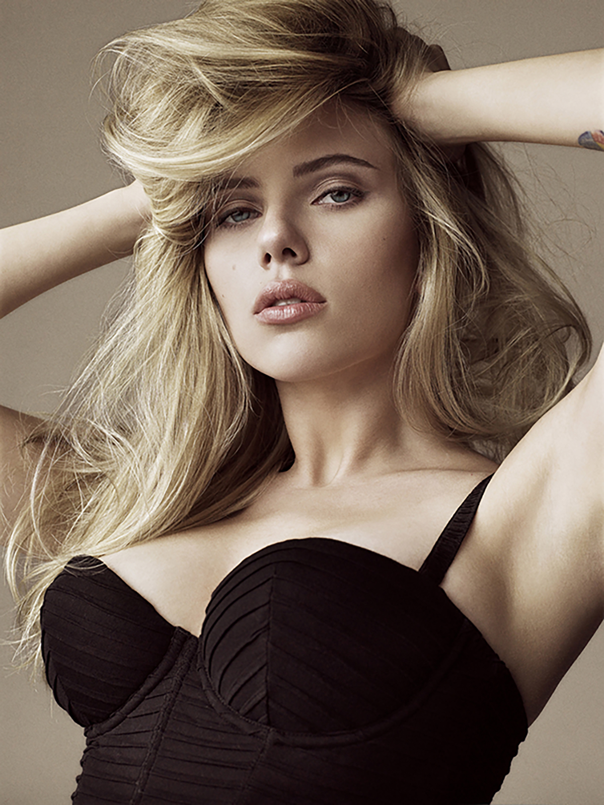
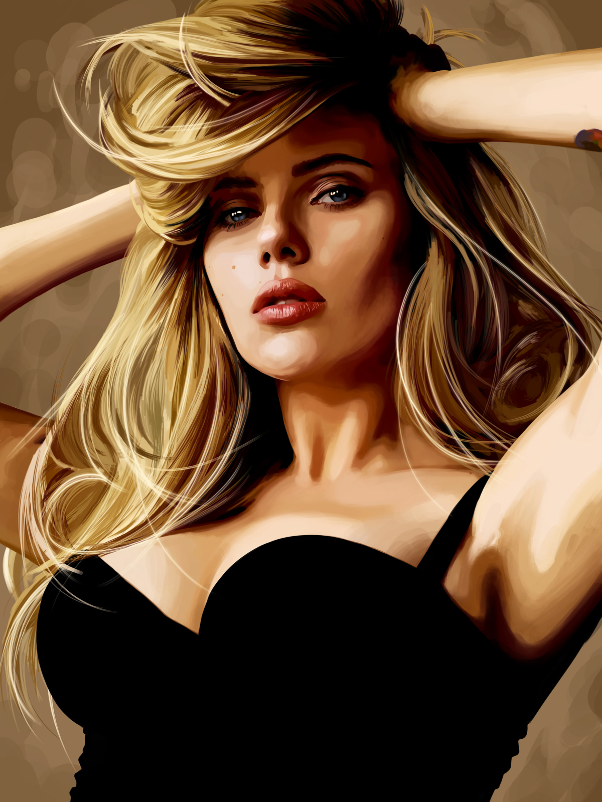
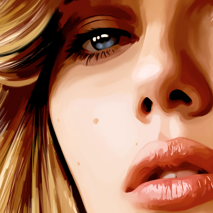
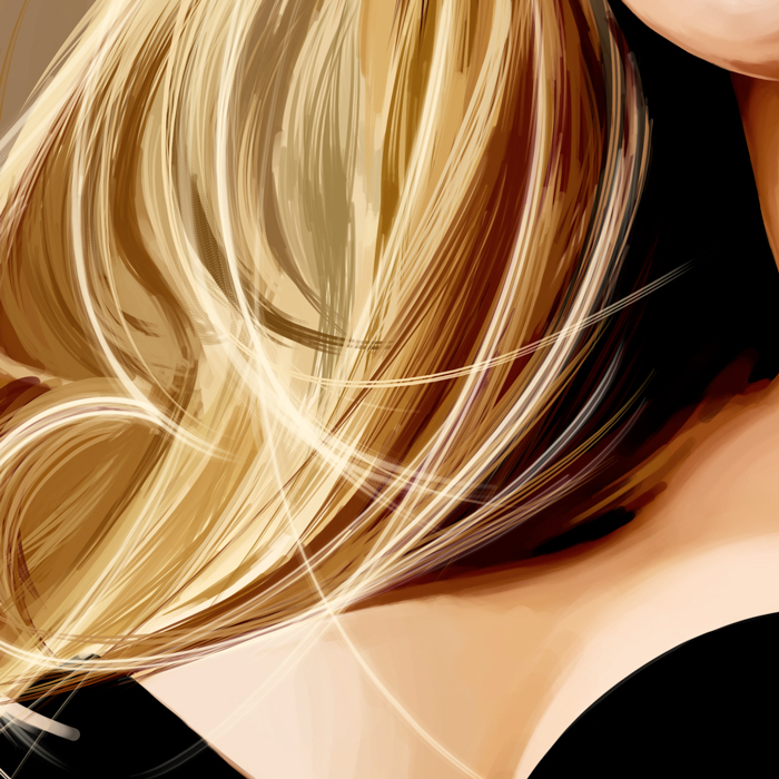
This portrait of Scarlett Johansson has been realised in about thirty hours on a 350×480 mm size, so a pretty big format requiring a constant attention to the details.

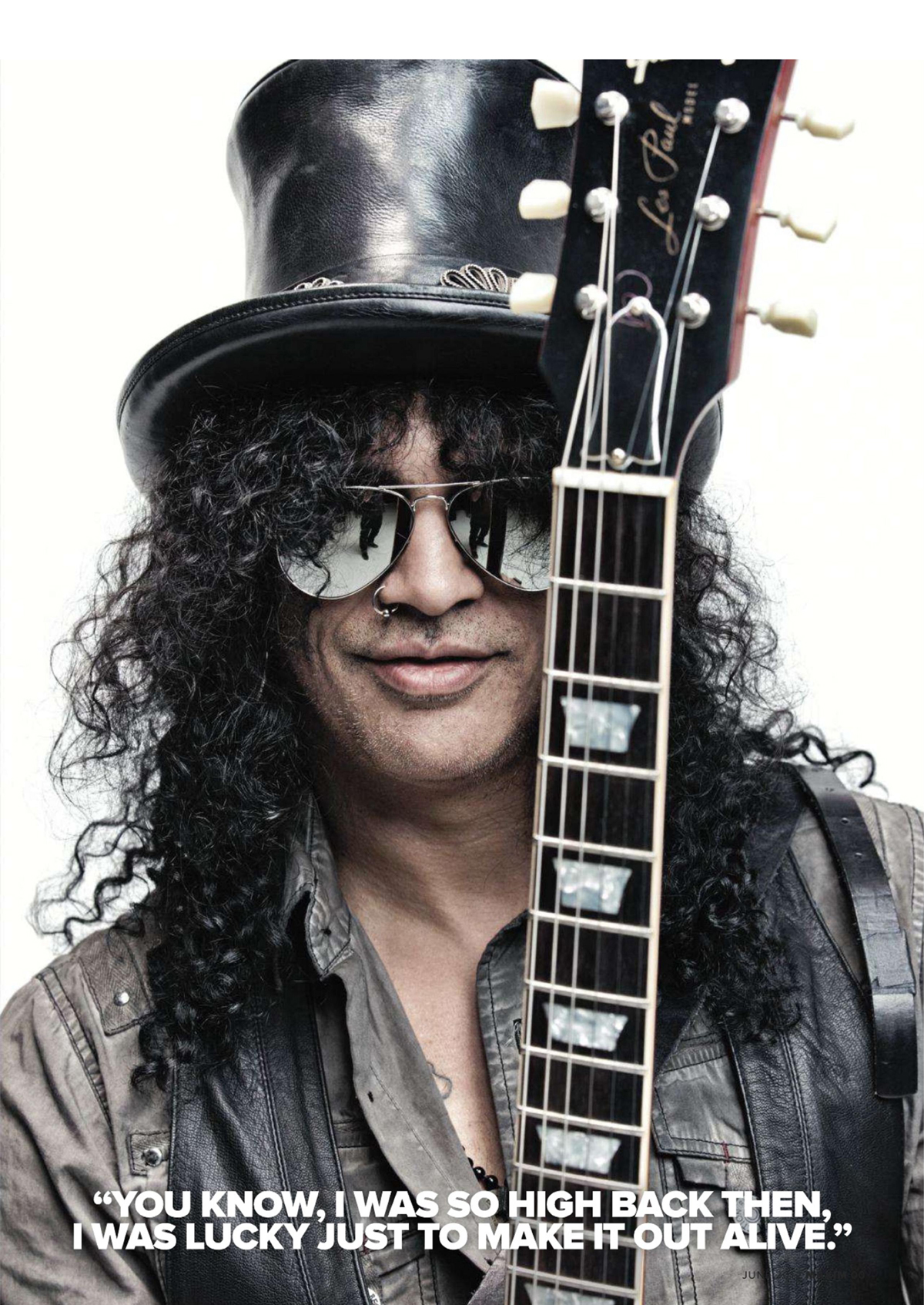
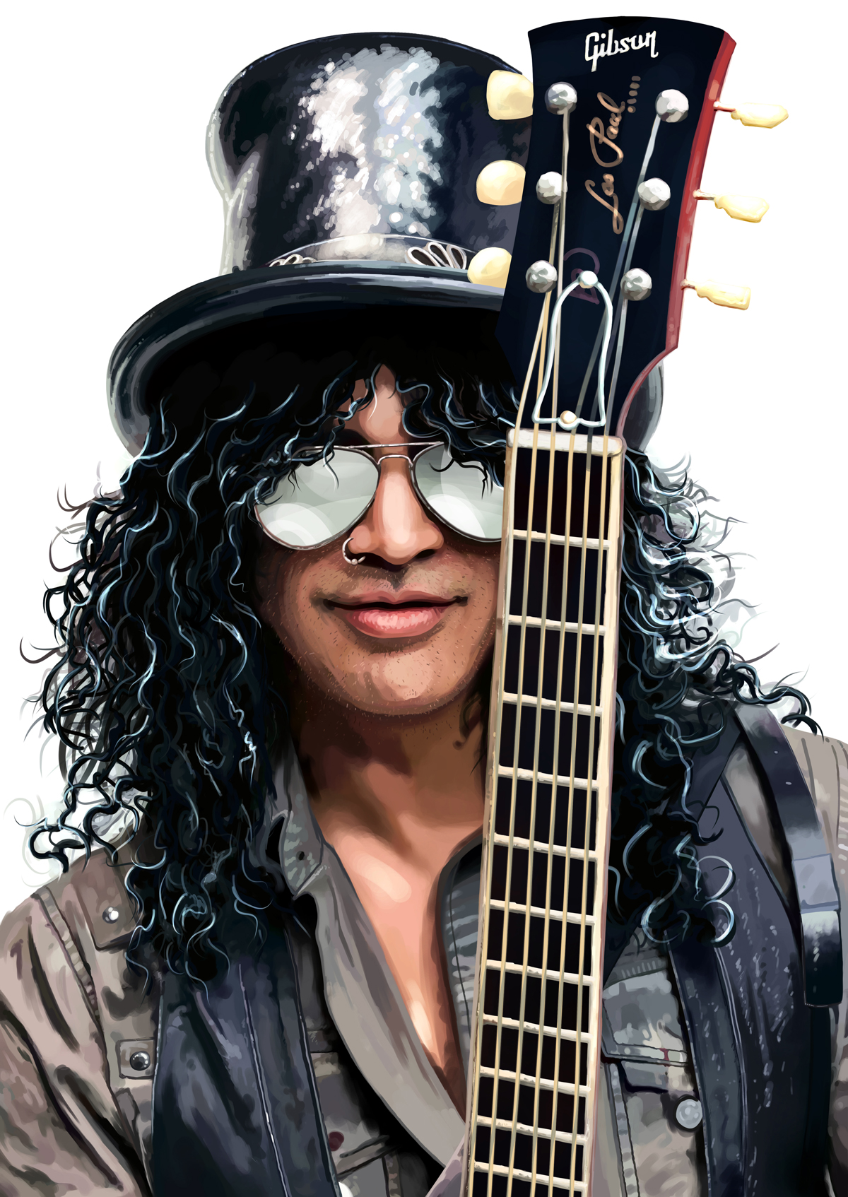
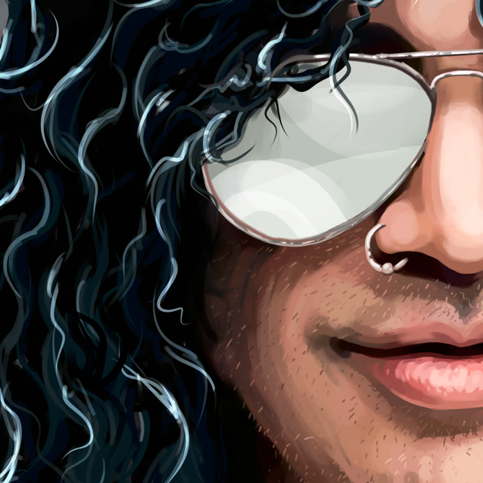
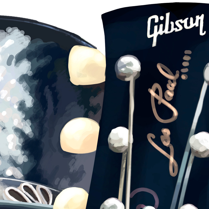
Slash is simply one of the greatest guitarists of all times. One of my friends is a big fan, so I drew his favorite artist for his birthday.

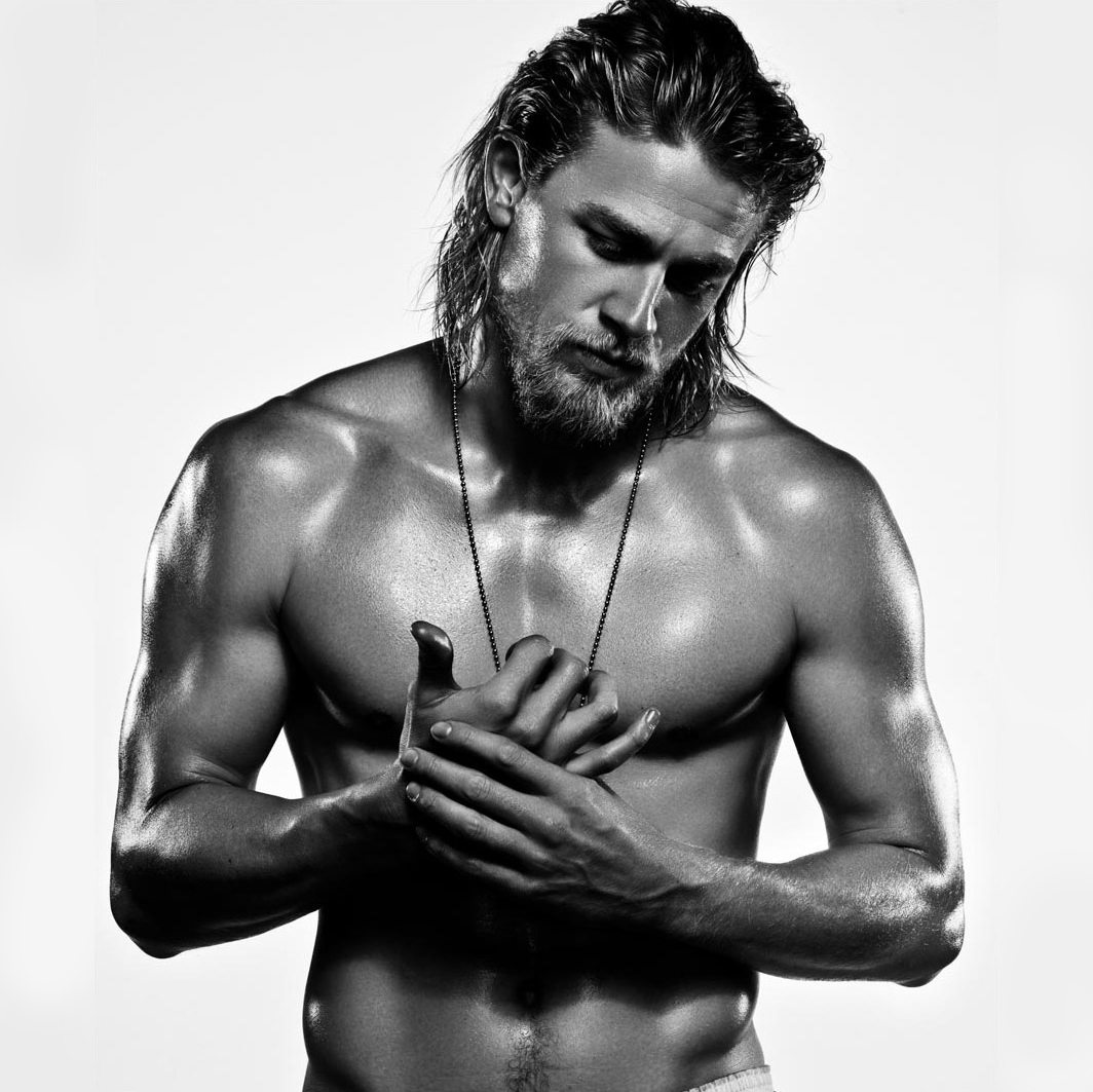
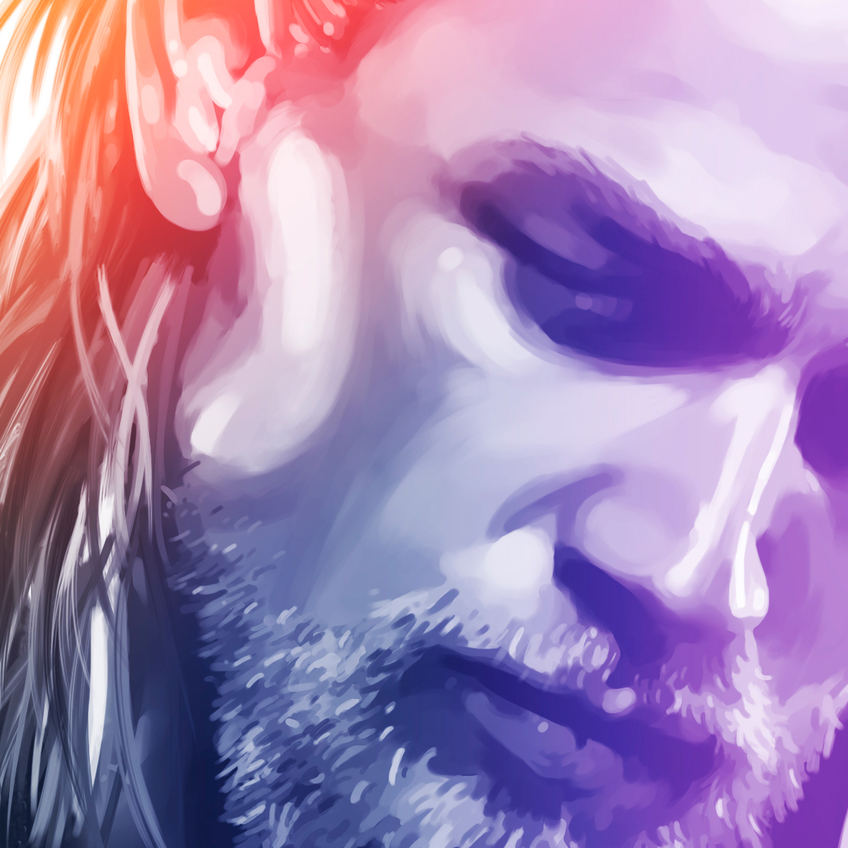
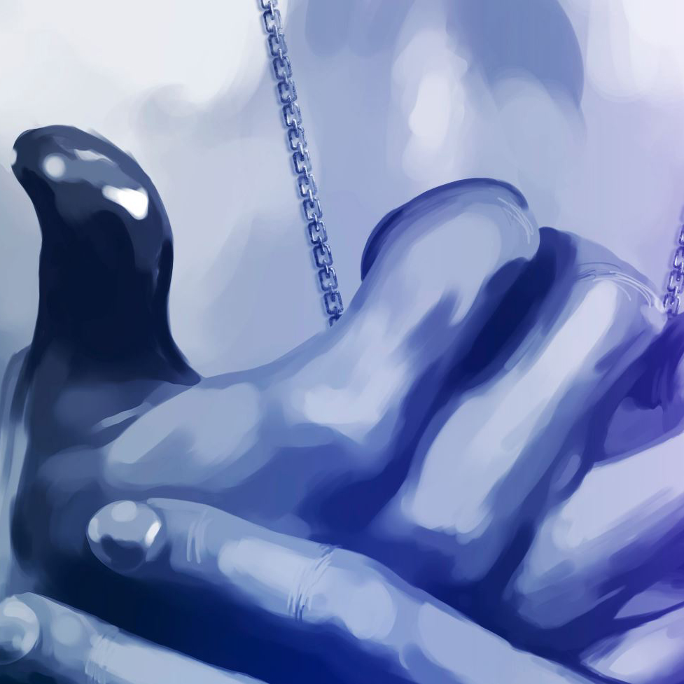
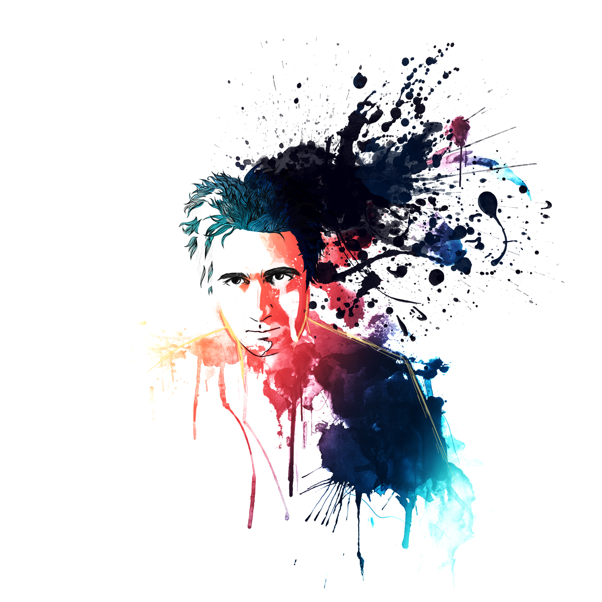
Charlie Hunnam is the main actor of Sons of Anarchy. I really loved the original photo, which I wished to interpret on my way by painting it in a different style.

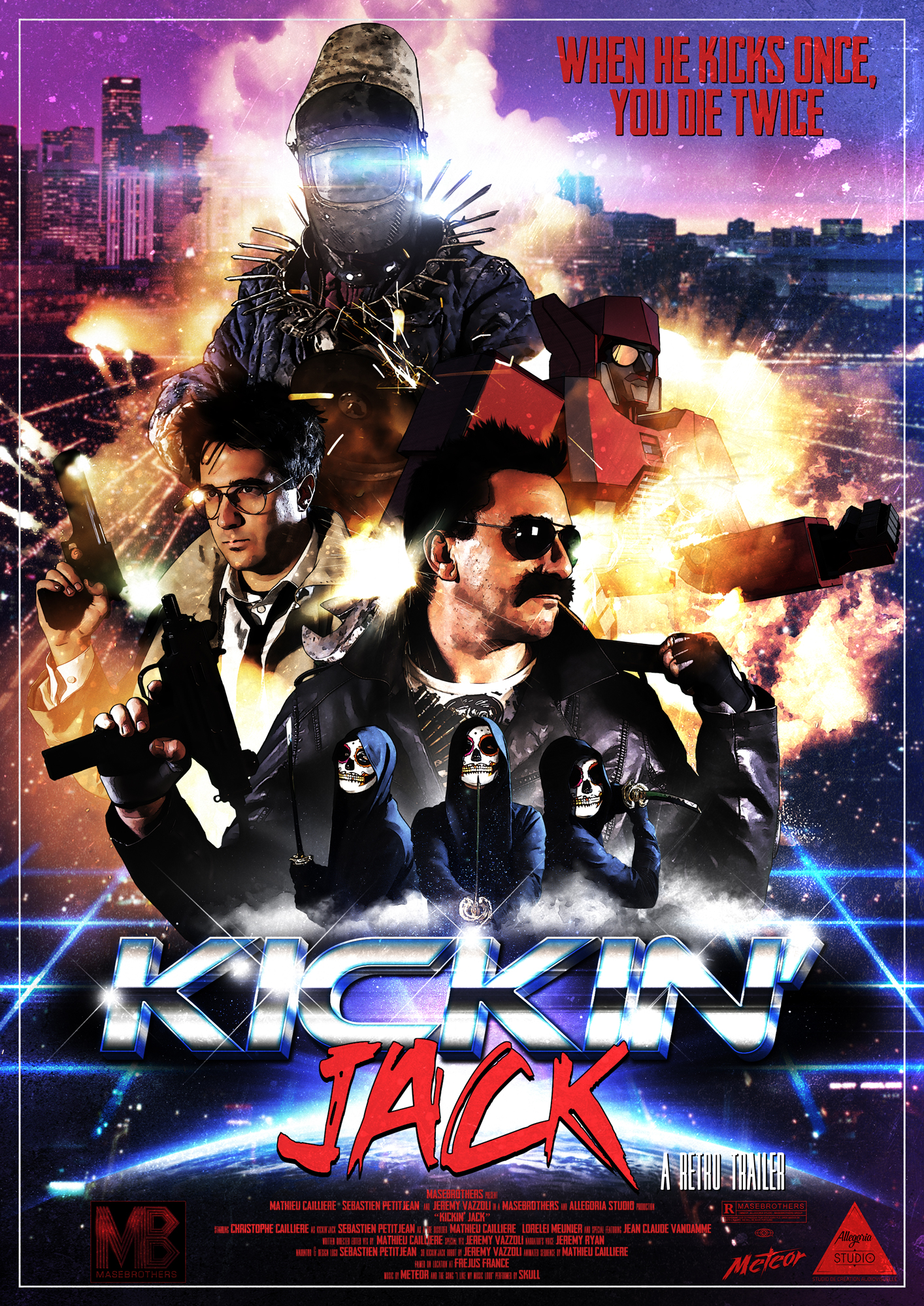
Mathieu Caillière is one of my best and oldest friends. He also is my sidekick on our YouTube channel MaseBrothers.

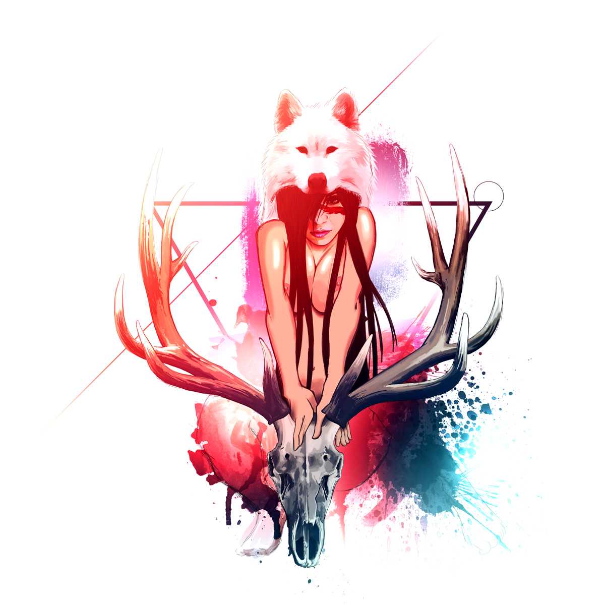
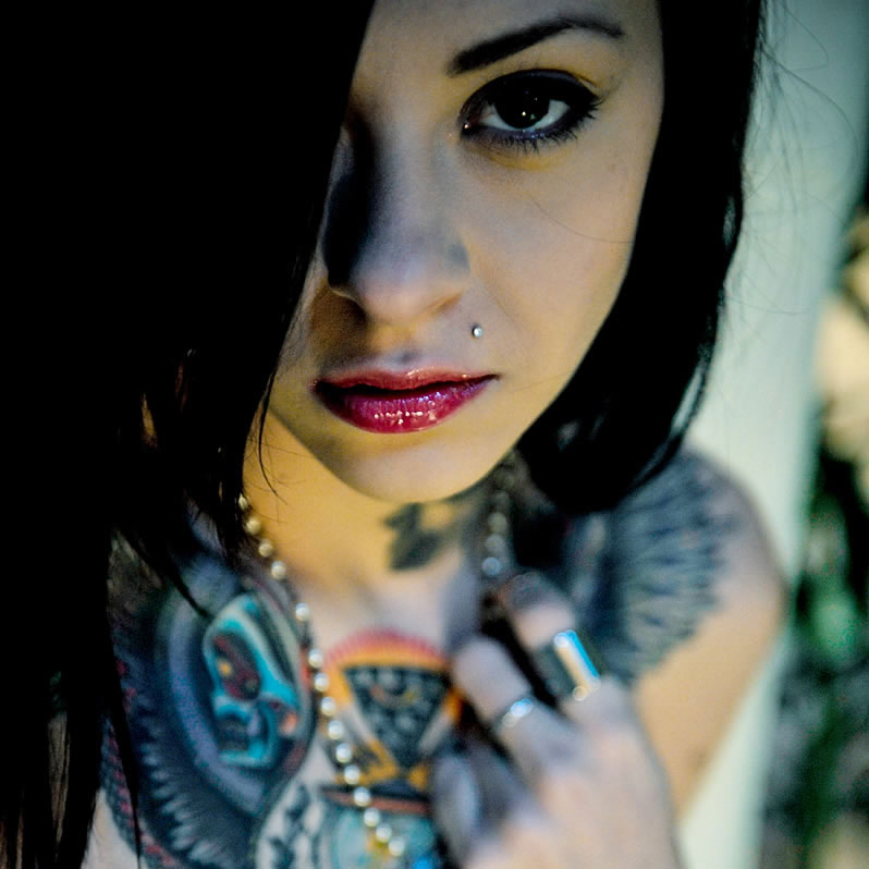
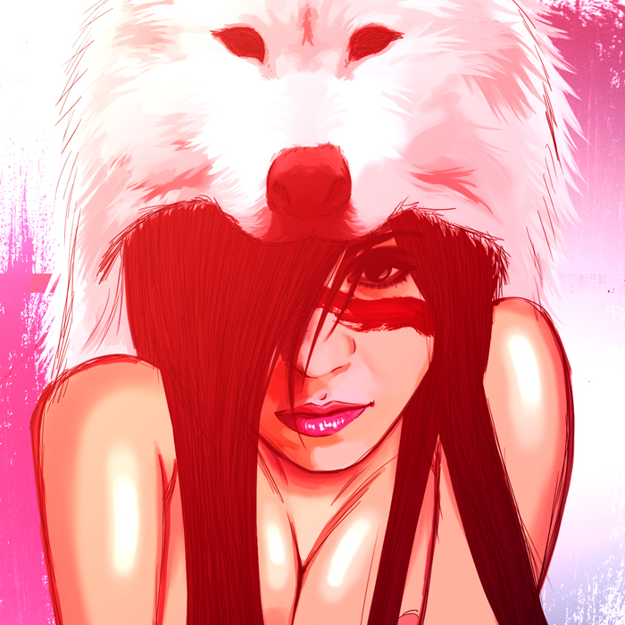
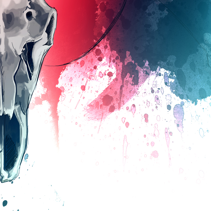
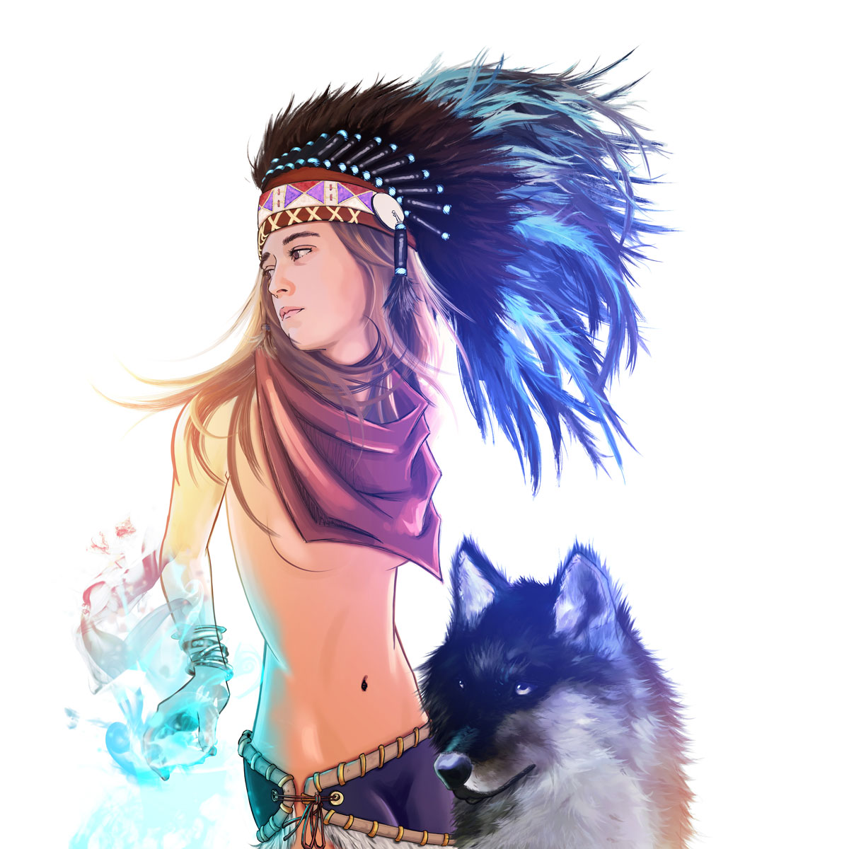
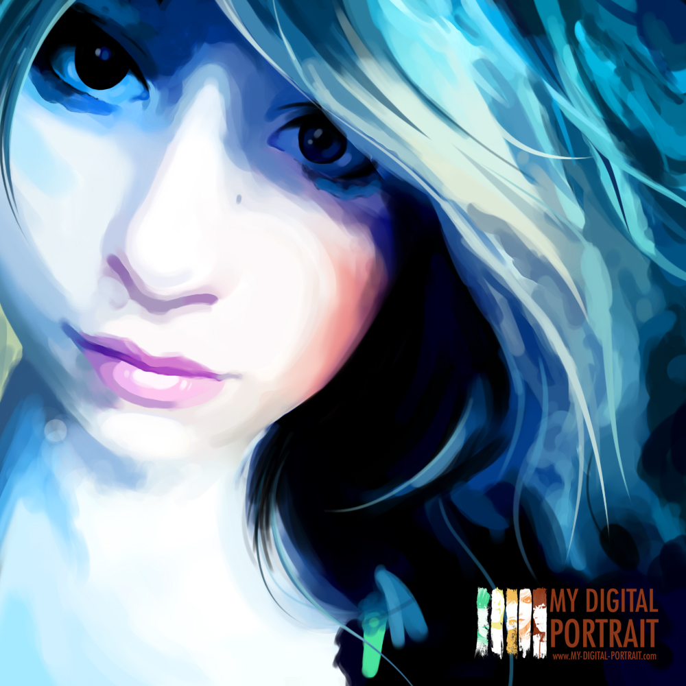
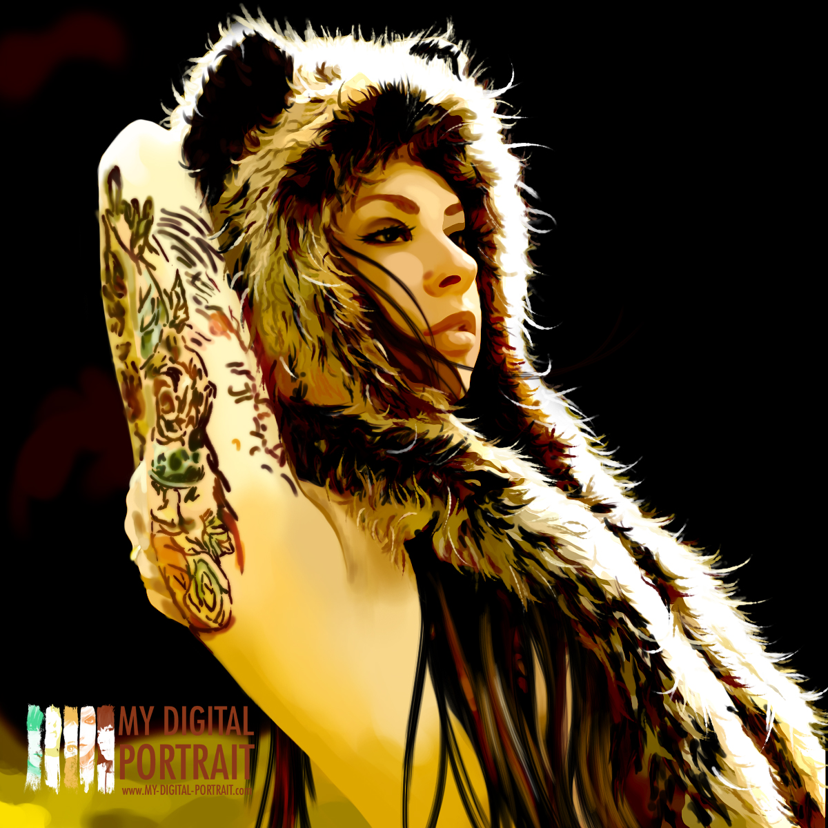
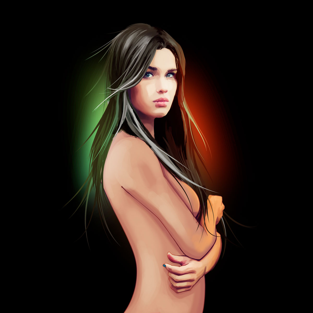
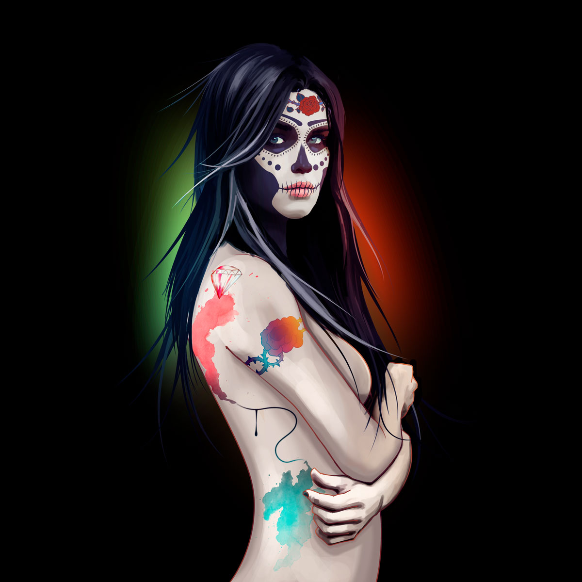
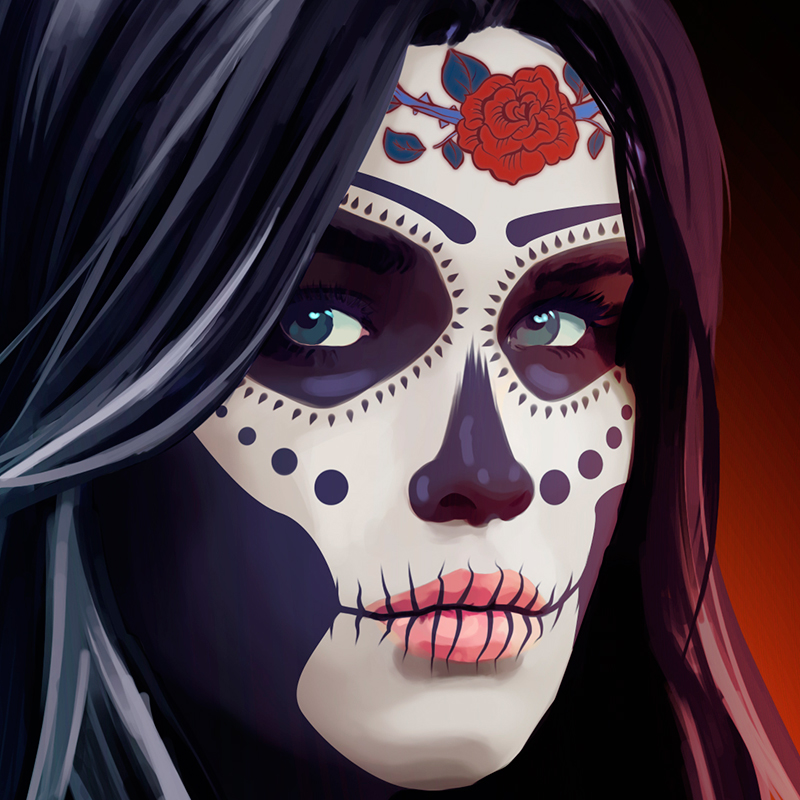
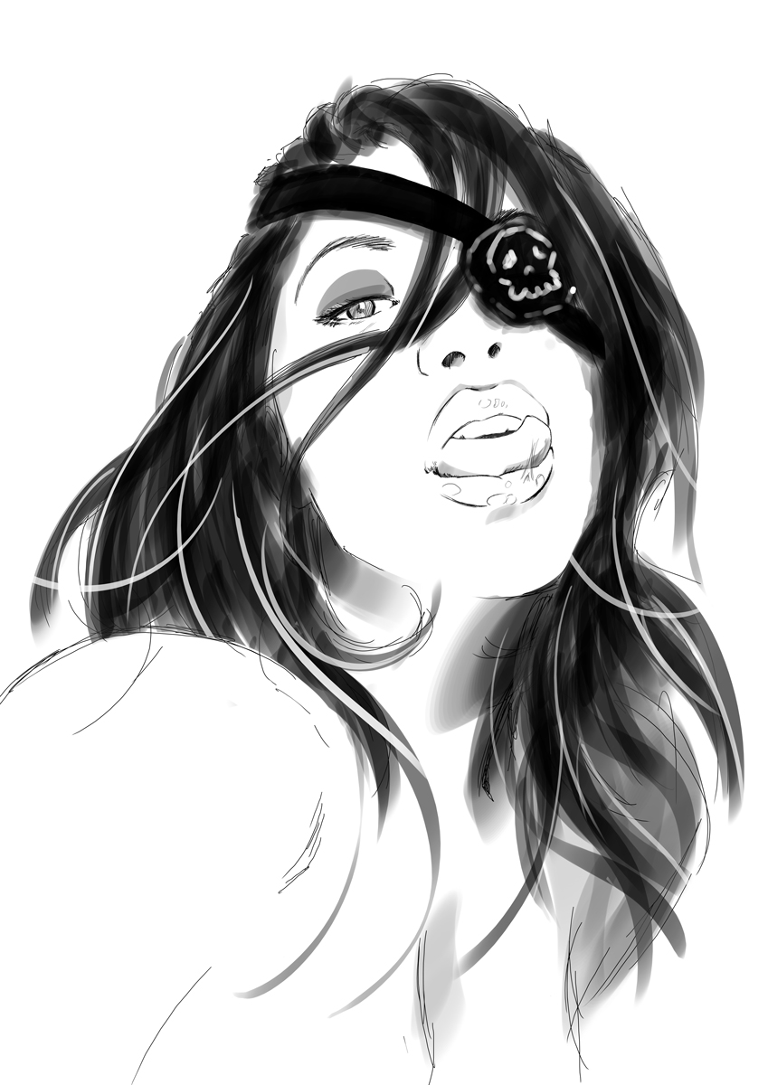
Queen of the Wolves is an artwork inspired by MissBlackWater while she was a photo model. She is nowadays a jewelry creator.

MaseBrothers

2018-10-29T17:57:45+01:00

MaseBrothers is the YouTube channel co-created with my childhood friend Mathieu Caillière (aka Allegoria Studio) on which he is the director and video editor.

Born of passion for the years that have rocked our childhood, we reuse the codes of the 80’s and 90’s action films in our audiovisual creations through short films and fake movie trailers.

I work mainly in pre-production (concept, writing, film preparation); filming itself (acting, lighting, direction of the actors); and finally in post-production (visual effects, posters, logo title, voice dubbing).

Kickin’Jack is the trailer of a movie which will never exist.

The concept was to create a fake trailer to show the whole story. The hero is an action man who thinks once he kicked, the one who intervene without having the time to call him.

The poster required several working hours. It was necessary to transcribe in a single image the explosive atmosphere of the trailer in a style drawn to the old. Since the trailer itself reveals absolutely everything of the film that could have been, I took the free will to show the maximum.


You can find the poster in HD and printable A3 format
here.


Kickin’Jack is one of the first MaseBrothers videos and also the most viewed in the channel.

Rage of Fire 2 est un court-métrage qui rend hommage aux films d’action des années 80 & 90, aux jeux-vidéos sur bornes d’arcades et à la Pop Culture.

Le film reprend les codes des jeux-vidéos de notre enfance, avec une scénarisation simplifiée, des dialogues courts et des effets spéciaux exagérés. L’action est soutenue par une musique synthwave et transite parfois avec des scènes de jeux-vidéos pures.

Rage of Fire 2 a obtenu le prix Coup de Cœur du jury au festival Frames d’Avignon en octobre 2018.

J’ai travaillé sur la création des personnages en pixel-art lors des dialogues, et ai joué l’acteur principal.

Les VHS (Vidéos Hors Services) sont une collection de programmes courts funs et décalés à la parution mensuelle sur la chaîne YouTube.

On y retrouve toute l’essence de ce qu’est MaseBrothers : de l’humour, du rétro et de l’inattendue.

J’ai travaillé autant à l’écriture et à l’organisation des tournages qu’à l’acting et les créations de logo pour les fausses publicités.

Albert Baptiste

2018-10-17T00:12:44+01:00

The Context

ALBERT BAPTISTE is a french clothing brand created in South of France.

The creations are fully handcrafted, from their conception to the finishes. The clothes have a vintage style from the Belle Epoque, with a contemporary diversion, and are destined to a 20 to 35 years old audience.

The Project

The company being created at the time of the brief, everything was to do ! And the freedom I could have had on this project makes it one of my favourite.

From the logo to the visual identity, the photo shooting, the print and web communication medias : I was in charge of the whole communication of this young  fashion creative.

The Logo

The Research

The client wished a calligraphic logotype, with the initials of the brand. I wished to propose her a signature logo type, since the brand is the property of an independant fashion designer.

The Color

I perceived a burgundy red aura on the client, I wanted to mix the sweet side of the color with the charm of her collection pour make it its main color of her visual identity.

The Logo

The achieved logotype.

It is easily integrated to the website but also on the clothing labels.

Le Photo Shooting

The photo shoot had to show both a touch of originality while highlighting the products. The photos had to portray a universe both dreamlike and clearly present the product.

Most of the photos have been taken horizontally for future use on the web.

The Web Site & the Shop

The website was designed to highlight the quality of photos and present the product clearly and from all angles.

Most pages feature full-page articles to emphasize the graphic side of the brand.

Each article also has its own product profile on ETSY, a platform for the sale of personal creations and made by hand.

Black Stars Limousines

2018-11-06T21:20:59+01:00

Brief

Black Star Limousines is a newly created company that offers the provision of luxury private vehicles with driver, on the French Riviera. The environment in which the company is to evolve is bourgeois. In this way, the requirements and the quality of service awaiting customers are followed.

Black Star Limousines needs a strong visual identity and stands out from the competition.

Sketch 1

Sketch 2

Initial concept

With a name so visually perceptible, the logo was almost self-evident. Starting from a black star was also part of the customer’s desire. It was then necessary to create an original black star.

Inspiration

The customer only used Mercedes-Benz vehicles, I analyzed the structure of their logo. The idea of inspiring me on the unstructured side to create my star, to get a little closer to it and unconsciously give a reminder to the brand.

Final

A five-pointed star is the idea of a star. Finding the right destructuring was one of the main challenges, in order to apply to it an elegant and prestigious side.

The website

The site was developed in WordPress, with several interesting features such as the online booking request via a discrete sidebar, and several options based on previous choices.

The site is fully responsive design, which is of utmost importance to be able to order a vehicle with driver from any mobile device. The means of contact such as the telephone or the mail are constantly visible for an optimal communication.

Declination of the visual identity

Micromania

2018-11-06T20:47:21+01:00

Mobile App Design

Micromania, the leading video games reseller in France, has developed a catalog on tablet of goodies during the summer of 2016.

Goodies are often collectibles, so it is not rare to struggle to find a dealer with stock. The application provides the customer with a catalog updated daily with availability, product details and prices of what he wants.

The application also allows the customer to build a basket from another tablet in the store, whether physical products (games in boxes) or numeric (DLC, Season Pass, PSN subscriptions, etc.) in order to checkout faster.

Wireframe

After a brief with the client, I establish a wireframe to explain how I envision the navigation within the application.

It is at this stage that we have considered combining the catalog of derivatives and that allowing to visualize the customer basket.

Design & Development

After some customer feedback, as well as internal validations including Sony and Microsoft, the wireframe and the design are validated.

The development of the application, conducted by Azur Mobile, finally begins.

Delivery

In a test version initially in a few shops, tablets are delivered to sellers.

Castelli

2018-11-06T22:29:32+01:00

The Context

Castelli is one of the largest gardening and outdoor furniture companies on the French Riviera. With an existence of over twenty years, the size and location of the store gives it a wide visibility and a monopoly on the market.

The Mission

As their logo gets older, it is time to refresh it and give a new look to their image, to raise the standards to meet the ambitions of the new direction.

Sobriety and elegance are the order of the day.

The renewal

I first started by removing the catch “C’est Merveilleux la vie” (It’s Wonderful Life) because it seemed obsolete and useless.

The activity sectors “gardening – pet shop – decoration” have nothing to do in this logo and will find their place in the different media of communication.

To bring more delicacy, I decided to remove the three colors and change them to a shades of green, while keeping the three sheets to remind the industry and keep an identity symbol already present.

During this mission, I realized all the communication media print.

Logo, monthly catalog, 4×3 panels and bus shelters, press announcement, business card and customer cards, mailing, flyers, invitations, roll up …

Realized within the agency What’s Up Communication.

Illustrations

2018-11-06T20:06:22+01:00

I drew a Skull Girl at the Salon du Tattoo in Nice to illustrate the poster of the event.
I drew the girl naked so that I could change the tattoos if adjustments were to take place.

Girl’s Power is a work created the occasion of a collective exhibition.

Preparatory sketches.

The Shadow of My Heart is an unfinished graphic novel in which novel and comics blend.

Edzing Lingerie

2018-11-06T22:21:16+01:00

The Context

Edzing Lingerie is, as its name very clearly indicates, a newly created lingerie brand, whose product prices are intended to be accessible to the public.

“Edzing” meaning “love” in Gabon, it was necessary that the communication is done starting in this direction, without being sexual.

The Project

Desire, passion, sensuality.

These were the key words used to prepare the photo shoot that would be used in the brand’s advertising campaign.

Brainstorming made it possible to prepare visuals and to discard others. In reality, an important part of improvisation and spontaneity make it possible to obtain very beautiful photos.

Les Ways

I used my premises at the time because of the large free space and the ambient light.

The second shoot was done in apartment to give a more credible atmosphere for the buyers.

The purchase of additional lighting and the intervention of a makeup artist became paramount.

The Photo Shooting

The photos were the least retouched possible to show a model as natural as possible; only the colors and the lights were raised.

The logo and the making-of were created by my colleague and friend Alexandre Napoli, aka A2HN.

Realized within the agency Storm Communication.

L’Épicurien

2018-11-06T22:43:10+01:00

Brief

L’Epicurien is a chain of stores selling wines, spirits and gourmet products.

Every quarter is published a magazine dealing with new wines, news about products, but also travel and reports.

It was therefore necessary to layout the magazine, following the editorial line while bringing some novelties.

The Challenge

A news magazine can not be written well in advance, and articles are often written at the last minute, so it often took several people to work in an emergency to complete the numbers. I had to adapt to the target and take back the visual identity already in place, while bringing a touch of freshness.

However, upstream work was done to cover any unforeseen events.

Réalisé au sein de l’agence Storm Communication.

Les Élus et les Pierres Stellaires

2018-11-06T22:45:00+01:00

The Author

Samar Hachem is a young author of novels. Her first series, begun at the age of thirteen, is called “The Elect and Stellar Stones”.

With five volumes published and a sixth and last volume planned for the summer of 2017, Samar intends to win in French fantasy literature.

The Mission

Already published, Samar was looking for an illustrator to continue publishing her series with an attractive cover.

The manga style was a special request from the client, as well as a creative and fantasy universe.

Although the first two volumes were already published when I knew her, I started working on the cover of his third volume.

Tome 1

During the re-edition of the first volume, the client used my services to illustrate all of her books, in order to maintain a homogeneity among all the volumes. After having told me about the course of events happening in the first volume, it imposed itself to stage the four main characters. I started by offering her some sketches before actually tackling the illustration itself.

Tome 2

For the second volume, the heroine was captured by one of the antagonists of the story. I prefered to focus on the dramatic side of the scene by highlighting the two characters. Everything had to happen in a desert at sunrise with a misty castle in the background. I really wanted the home of the vampire to appear without being too present, so the subject of the illustration remains the two characters and not the scenery.

Tome 3

Chronologically, this is the first cover I made for the client. The characters are in a labyrinth during dawn, when smoky bright-eyed creatures emerge from their lairs to capture the lonely souls of the place. I had to show the characters stuck in the maze, but the scene had to have a little dynamism without losing the mystery.

Tome 4

This fourth volume takes place on the edge of a lake, where there is a mysterious island with a sacred temple within it. The heroine advancing in her quest while having grown up, I had to portray this maturation and this evolution of the story by illustrating a more mature world, always stalked by the main antagonist, without losing the fantasy places .

Les Élus et les Pierres Stellaires are available at Éditions du bout de la rue.

Publishing

2018-11-06T21:54:21+01:00

The Context

I made dozens of book covers for different publishers. Most of the time, I began by reading a summary or the text on the back cover to give me a general idea of the book. But very often, I ask more details to the author to grasp the essence of his text. Unfortunately, I do not have time to read the books for which I work, especially since most of the time they are still in the test state being corrected.

Even if the content is good, we can not deny that a book catches the eye thanks to its cover, so it’s a difficult challenge for me because I have to illustrate at best what he is talking about, without revealing too much. I decide either to take a specific scene, or to thematize the book through a single image, either through photomontage or digital painting.

Easy Love

2018-11-06T20:56:57+01:00

Easy Love is a chain of adult toy stores and lingerie.

Wanting to stand out from the competition by having a sexier than vulgar visual approach, I realized several advertising campaigns. Armed with my camera, I made several shootings with different models.

I think one of my biggest prides was seeing a vandalized bus stop near my office where the day before the poster was still there …

Realized within the agency What’s Up Communication.

Go to Top